
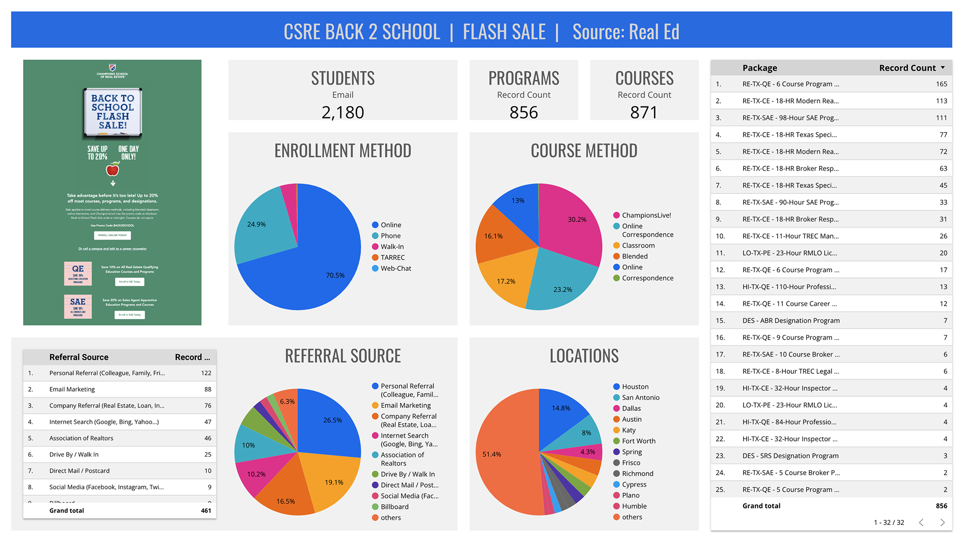
Interactive Dashboard for Marketing Email Campaign
I designed this dashboard to measure the effectiveness of a marketing email campaign I also designed and developed. It uses 3 data sources for data visualization: Campaign Monitor (email provider), Google Analytics (advanced e-commerce), and data from a proprietary LMS (User Data, Product Data) used by the organization.

Data Visualization of Five Years of Online Student Enrollments
I designed this slide for an executive presentation on the effect of COVID-19 on student enrollments and course delivery method trends. Data is from one single proprietary source and processed using Google Sheets.

